
Pifo Brand
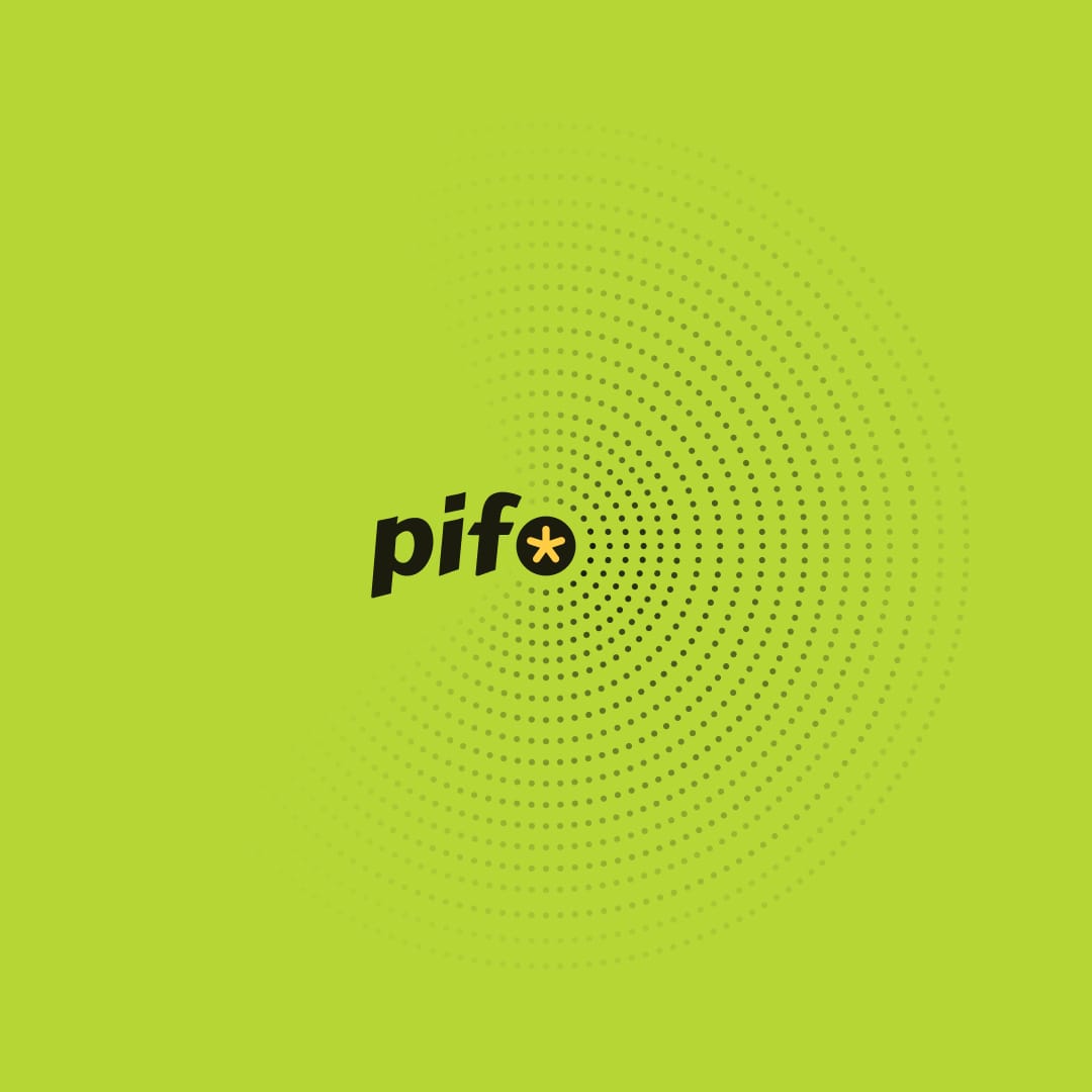
Unveiling the all-new #pifo 🎉
Every designer has a unique approach to branding. My way is more like planting a mango tree and allowing it to mature with time. By nurturing for many years, the tree grows fully to yield the sweetest mangoes beyond what I could imagine. This process mirrors my approach to creating brands.
I start with an idea and allow it ample time to evolve. Five years ago, I planted the idea of #pifo in my mind and let it mature into a brand. The term #pifo emerged gradually.
I began with a Facebook group, then transitioned to a Discord channel. At one point, I closed it, daunted by the demands of maintaining a community. However, the potent idea refused to die. In 2022, I resurrected Maker's Guild, introducing clubs for reading, writing, speaking, and learning. We then created a networking club to maintain human connections and the integrity of the sub-clubs. The guild steadily grew in size and activity. At one point, our phones would slow down due to the influx of over 400 messages each time we opened the app. I thought that was a good problem to have in a world which has 1% engagement.
Paying close attention to the club members, I started multiple initiatives on the go. The 7Cs (Community, Circles, Challenges, Courses, Clinics, Content and Conference) came together and made #pifo more meaningful.
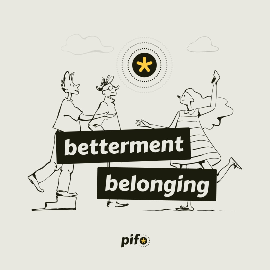
Initially, I considered it a product innovation (pi) foundation. However, I soon realised that it was more about progressing individual (pi) than products. To learn the untaught, we needed to foster a sense of belonging and betterment, which is precisely what the brand identity represents.
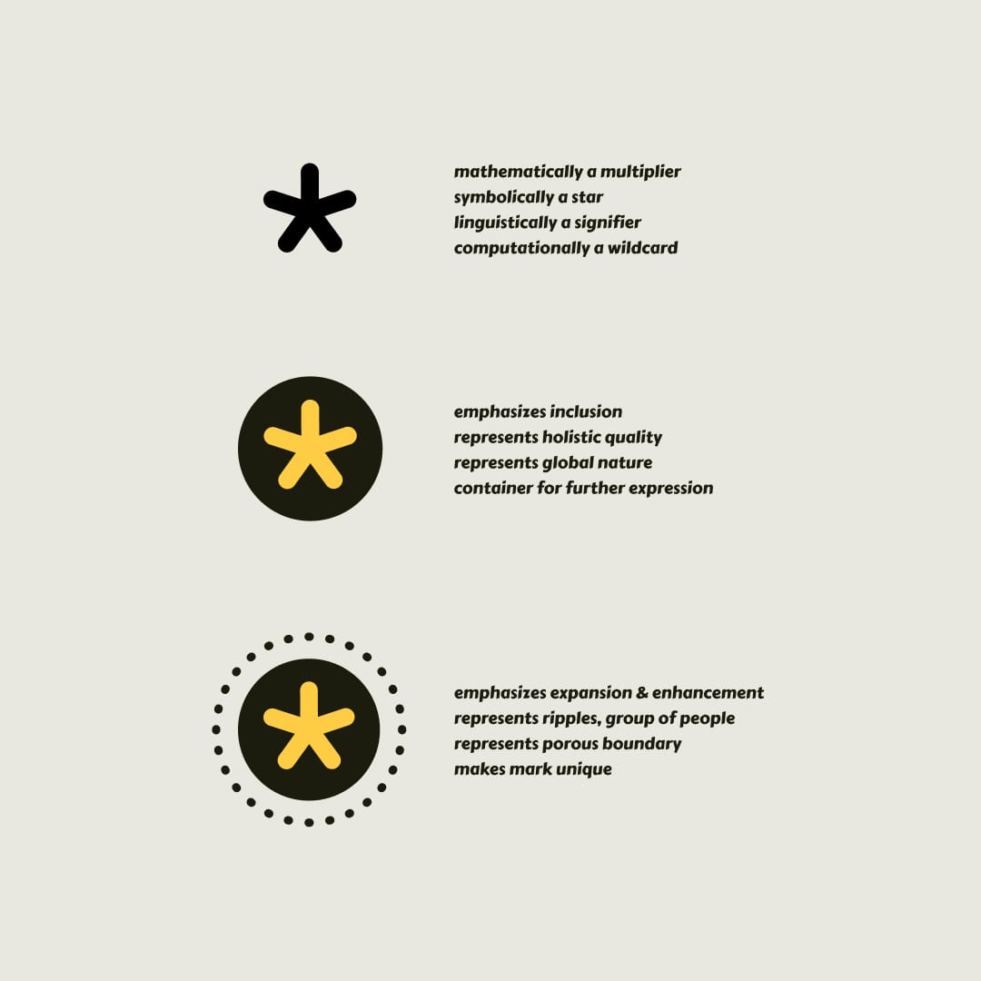
The brand symbol, an asterisk, is a multiplier but also is a star representing the individual. The dotted line represents a space that embraces individuals, indicating a sense of belonging. In semiotic terms, the brand represents individual betterment powered by collective belonging.
If you look closely, the chosen typeface represents the brand both in expression and in utility. Carter One, a typeface that expresses the brand (simple, friendly, approachable, and organic proportions - representing human aspects) and Commissioner, a typeface that is both friendly from afar and professional at the core just like the characteristics of #pifo. Built on science and sense. The ripple effect of #pifo is to signify that betterment is expansive.
I couldn't have trusted anyone else with this exercise other than my friend Arjun from UXLabs. He established the brand experience to what #pifo is at its core through visual expression. We are continuing to build the brand assets in the coming weeks. For today, here is a treat for your eyes 🔥

🥂 to #pifo!