Typography, a POV
As a cognitive science student, I was not formally trained in Typography during my masters. For that matter nothing about visual communication was a part of our curriculum. We were busy knocking anthropometry, ergonomics, cognitive psychology, social research, anthropology, HCI and the likes.
I did my dissertation on sleep and fatigue for long haul flights (Singapore Airlines) under the supervision of Civil Aviation Authority of Singapore. The language and vocabulary of human factors was intact there as well. When I got my degree (along with a medal) I was feeling super confident I aced the design world.
When I stepped into the industry, my first project was to make Starhub (the Airtel of Singapore) Enterprise Application better. Majority of the project had nothing to do with much of ergonomics or anthropometry. It was all about application of Human Computer Interaction (HCI) in the digital world. They expected me to redesign the application in 3 weeks. I didn't understand head or tail. I ran back to my professors to ask about how to go about the project? They shrugged and gave a cool answer that I need to work with a graphic designer to get the visuals going.
My heart sank! How did I go through an entire masters not knowing about a big part (User Interface Design) of digital products? In all honesty my journey with digital products started there. I self taught myself all the aspects of visual communication. The rest is history.
I still feel the imposter in me when I speak about visuals even after two decades. But I know strongly inside me that intangible thinking process from the cognitive science world culminates into the tangibles of the visual world. I experientially feel it in every cell of my body. When I met Arjun (my co-founder) in 2012, my thought process got validated.
Today I want to reveal the secret that makes our design process in Xperian efficient and effective. The simple answer is understanding text to its bones aka Typography.
In shorts, the Pareto of visual communication is typography. If you understand type better, you will understand design better because type is everywhere and 95% of digital products is type. It is a fundamental part of our lives. We communicate using type.
First time when I got introduced to Type I felt, how much more I will need to know about writing ABCDs? 🤦♀️ I was totally wrong. How naive?
It is not about ABCD. It is about geometry, shapes, combinations, expression and more. Every typeface has a purpose and character.
Type is like people. It has personality. It can be barbaric. It can be very civilized. It can be elegant. It can be crude. It can be anything we want it to be. A story can be told with just type.
Here is one as a sample
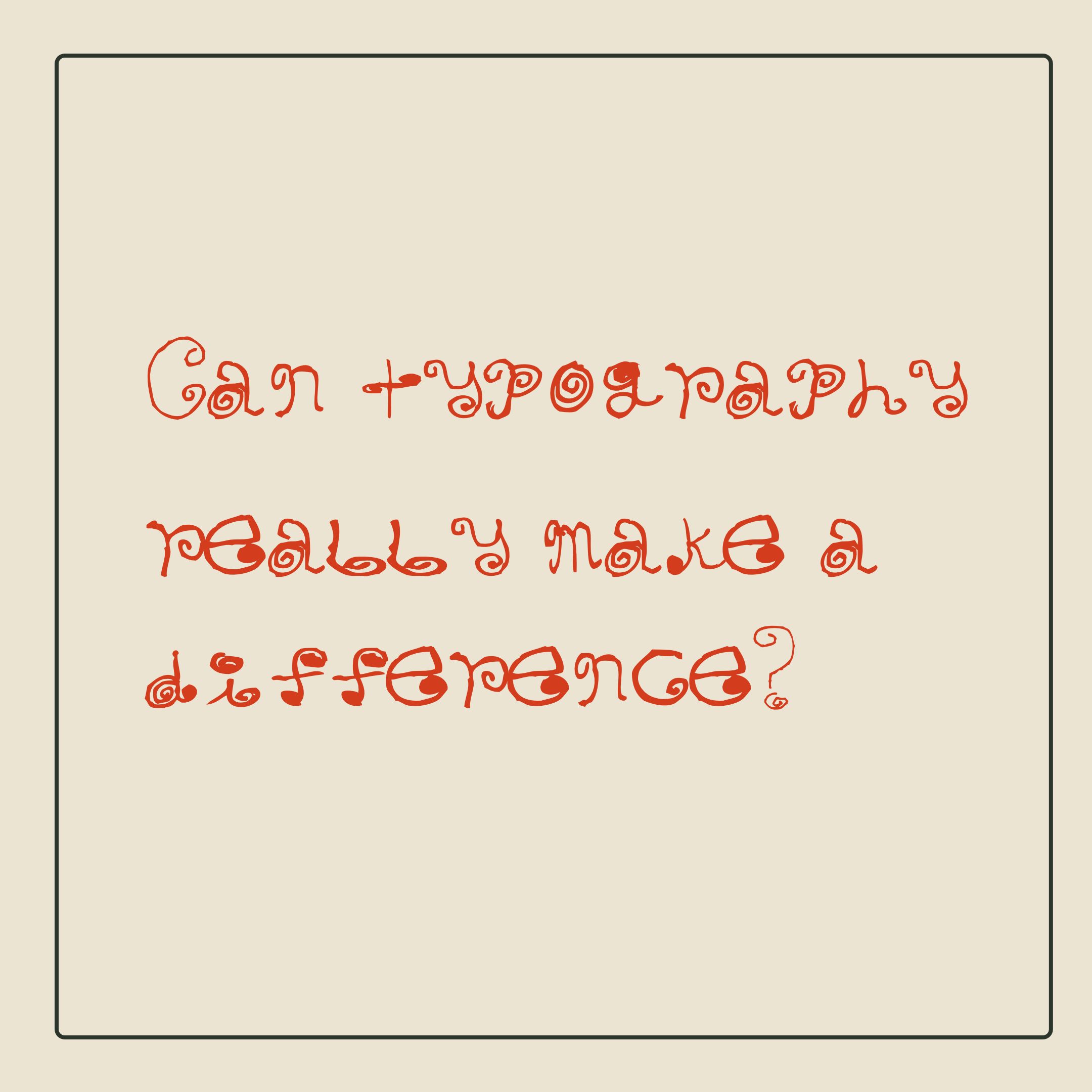
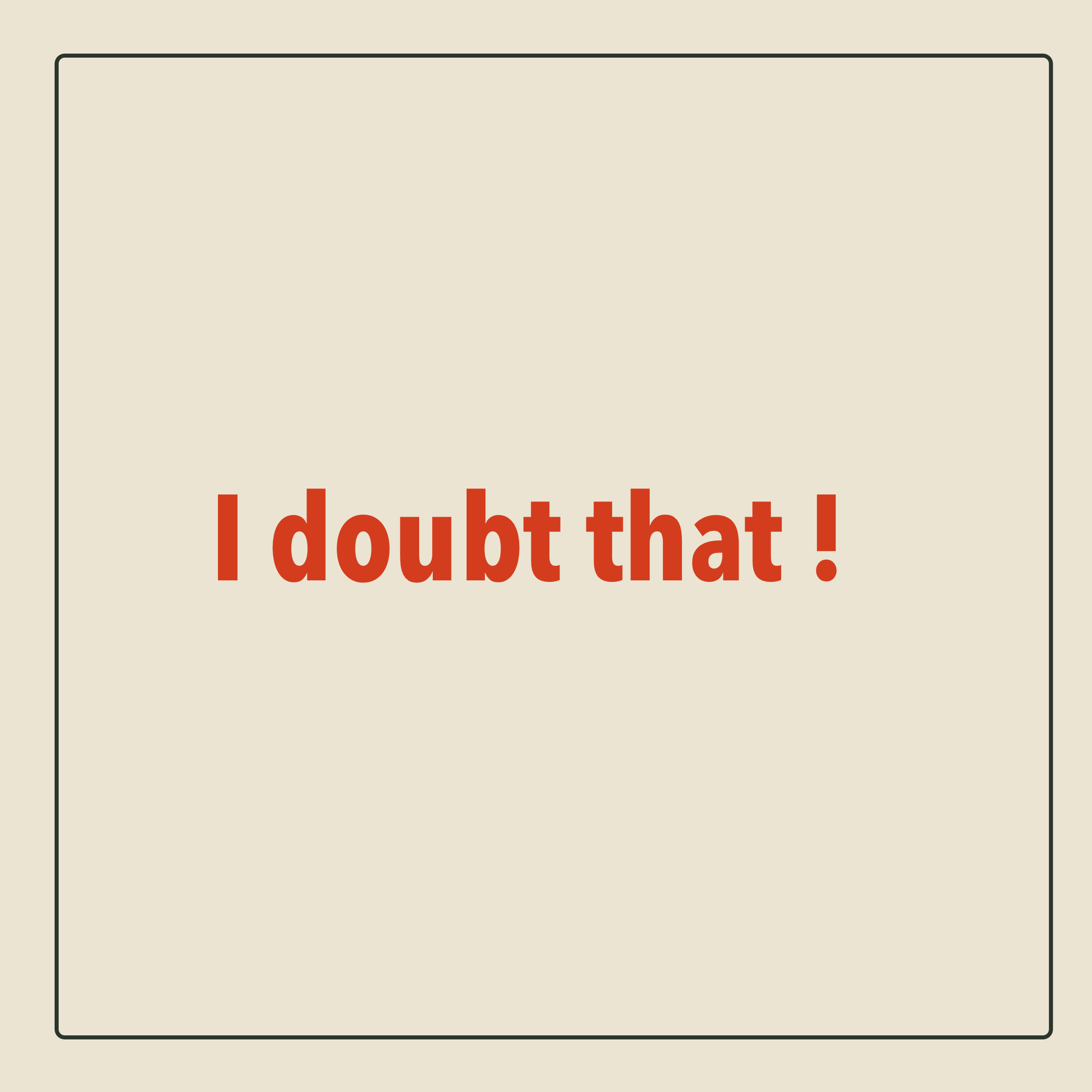
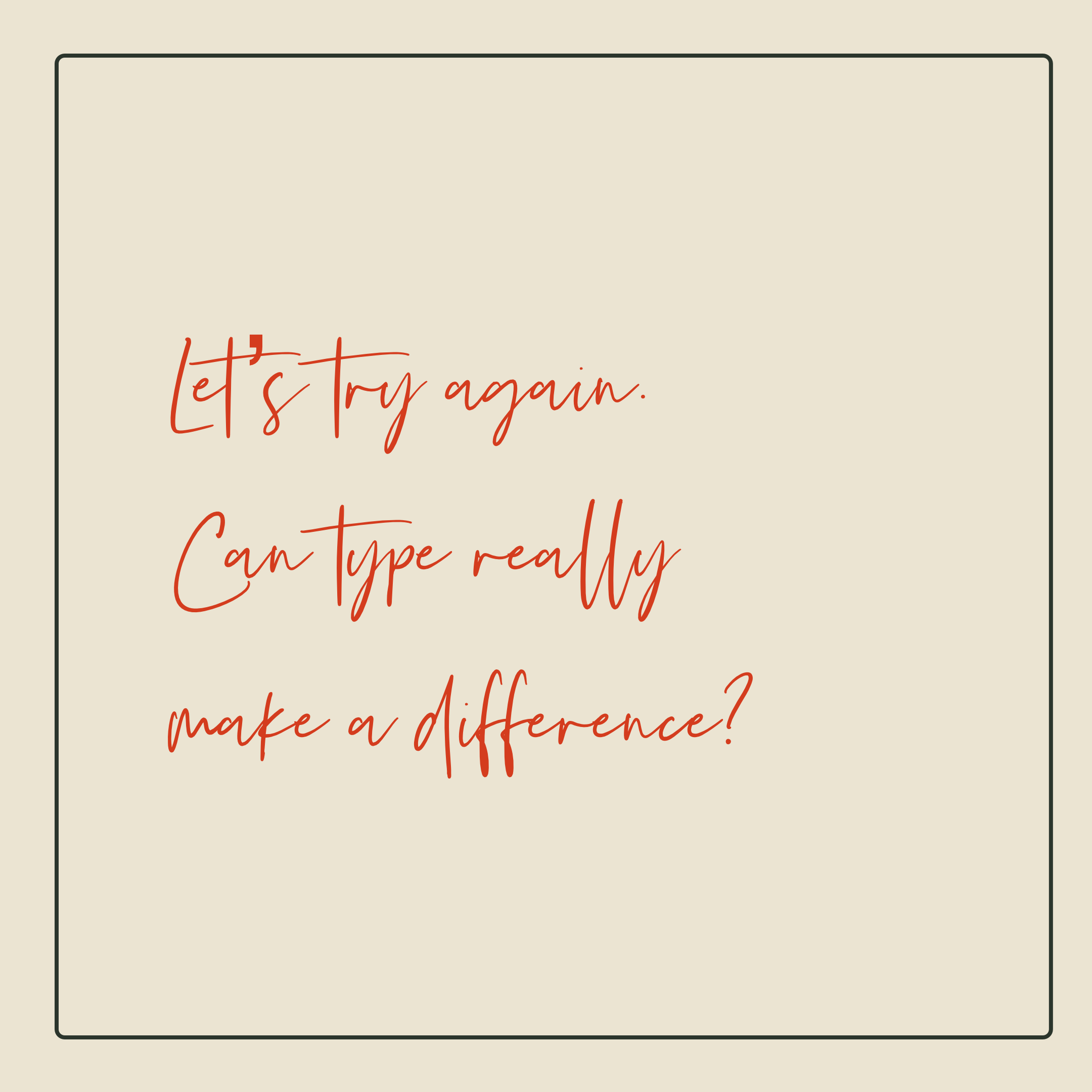
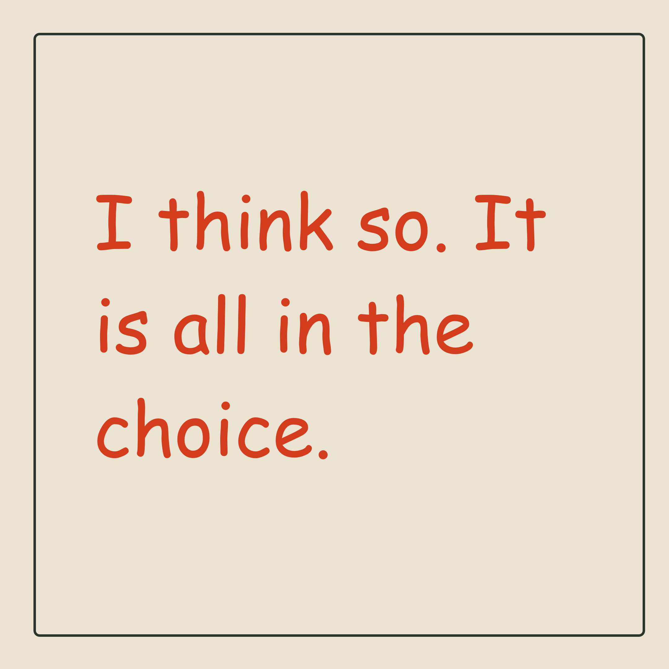
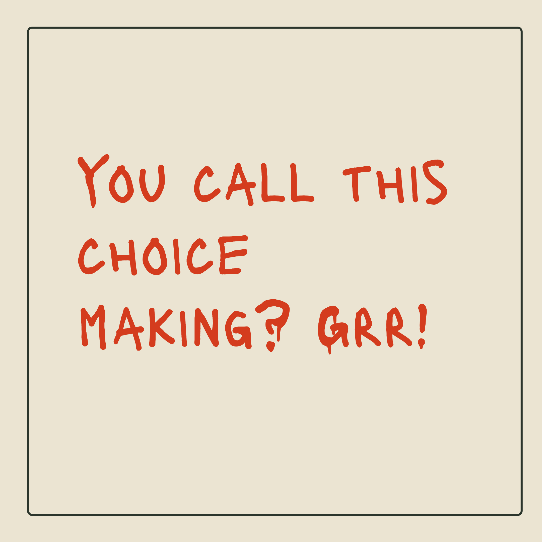
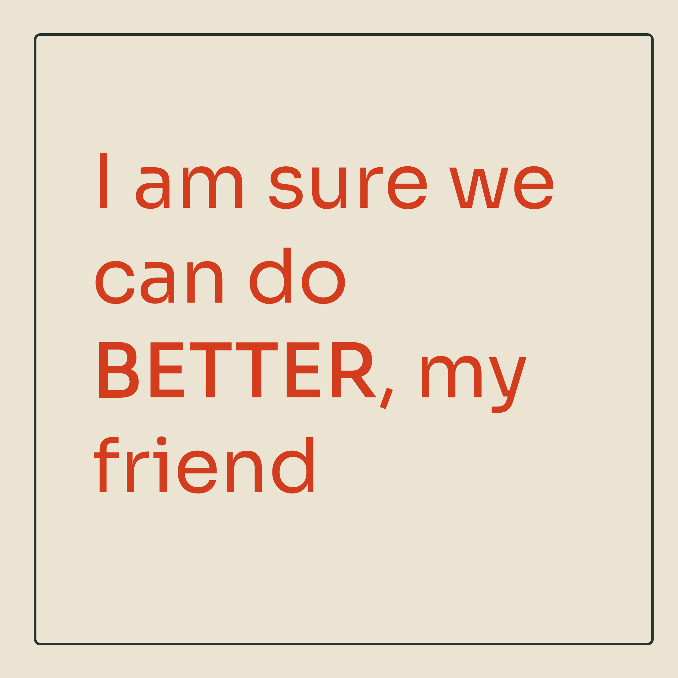
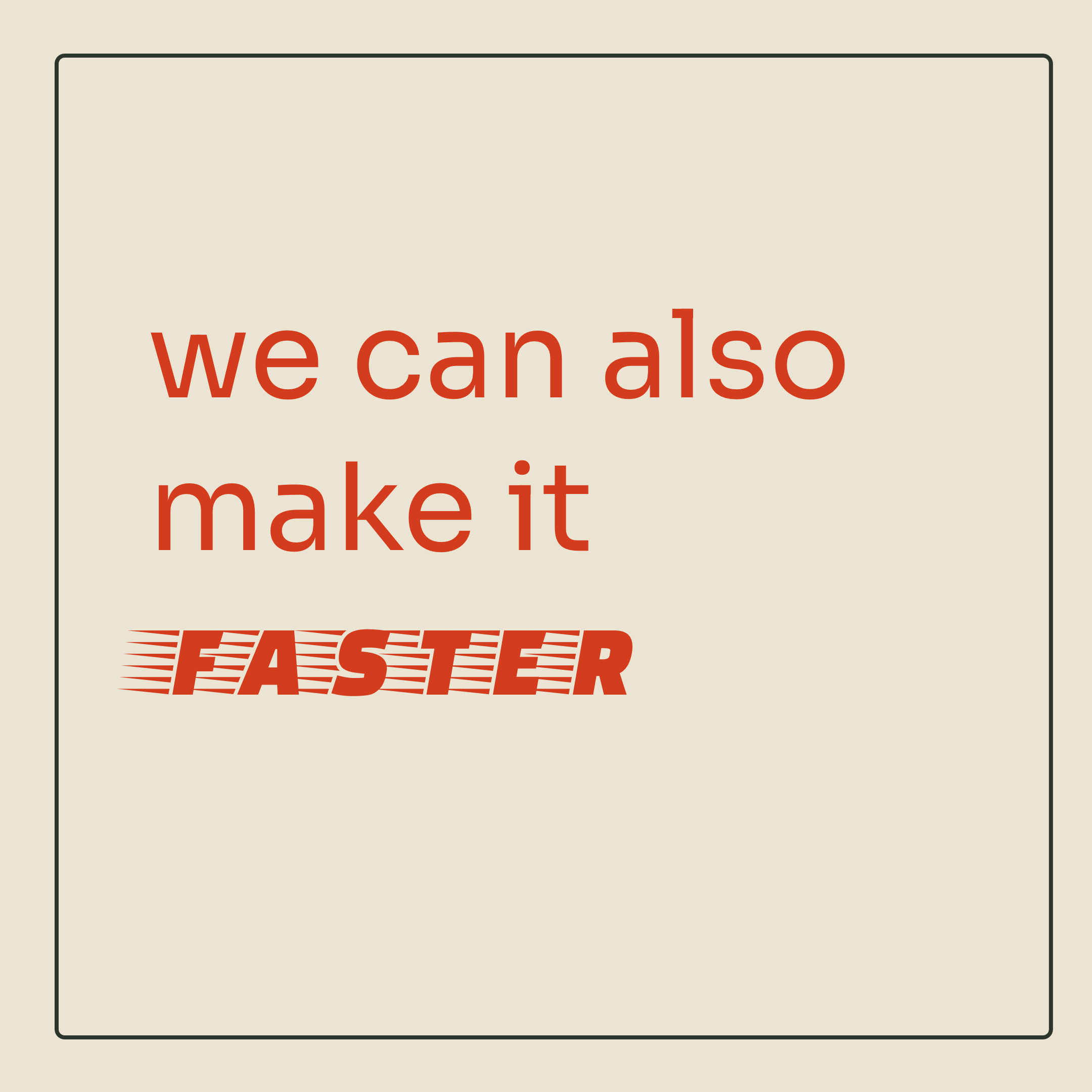
I just played with a bunch of typefaces above for the fun of it. We can spend days and nights figuring out the right typeface for a given context. It is addictive to look at the slabs, sharp corners, strokes, irregularities, counter, kern, size and more.
Next time when you see ABCD or 1234, look a little closer and see the hidden geometry (or lack of), legibility (or lack of), readability (or lack of) and more.
🥂 to type!
